It’s like an upgraded version of the traditional pastel palette – very grown up, yet elegant and airy.
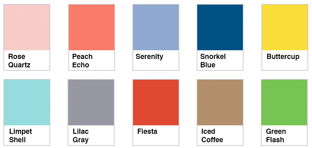
Introducing Pantone 2016 Color Trends
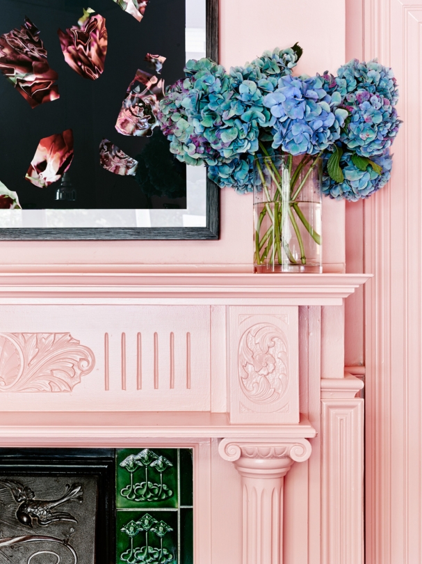
[mks_dropcap style=”rounded” size=”52″ bg_color=”#dd5f5f” txt_color=”#ffffff”]W[/mks_dropcap]ho knew pastel colours would be making a major comeback in 2016? Gone are the days when pastel was reserved for kids rooms and nurseries! This 2016 palette is gentle, soft, and has a hint of spice that makes it grown up and modern. You can stick with the traditional pastels Rose Quartz and Limpet Shell (pastel pink and blue), or you can make your home more fiesty with some Fiesta and Snorkel Blue for grown-up glamour.
Baby Pink Pastel in “Rose Quartz”
I love this pink pastel living room for a variety of reasons! The 50’s lampshades and floral artwork, the green sofa in the corner, and the black front door scream uber stylish and chic. If you’re looking to recreate this pastel living area for your space, Pantone’s Rose Quartz makes a stunning wall color. Not sure which colour to pair it with? “Green Flash” can be incorporated through a piece of artwork if you’re scared to go all in.
This modern home dubbed the Planchonella House is nestled in a rainforest in Queensland, Australia. It features a U-shaped couch in baby pink Rose Quartz. The glass walls and breathtaking views won this home an award at the Queensland Architecture Awards.
Must-Have Pastel Home Essentials:
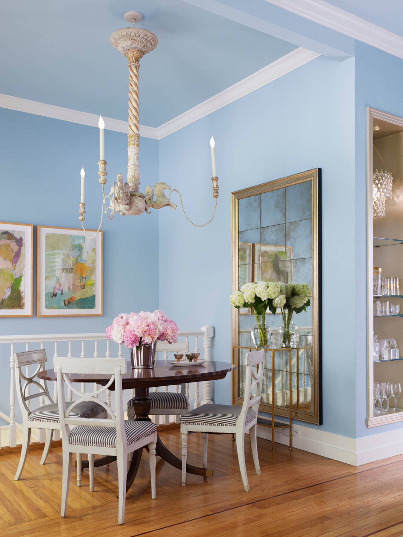
Ice-Ice Baby: Blue Kitchen in “Serenity”
[mks_pullquote align=”left” width=”300″ size=”24″ bg_color=”#78b3c9″ txt_color=”#ffffff”]If you’re looking to paint your cabinets a pastel blue, make sure you consider the colour of your appliances, backsplash, and countertop before you paint.[/mks_pullquote]So cool and refreshing! “Serenity” is Pantone’s second pick for colour of the year. Are you considering painting your kitchen a pastel blue? Makes sure you consider what you’re working with first! If you have a white or gray kitchen, blue is a perfect match. It also looks great with any colour of hardwood floor; from maple to chocolate brown.
Get The Look! “Serenity” Kitchen Essentials
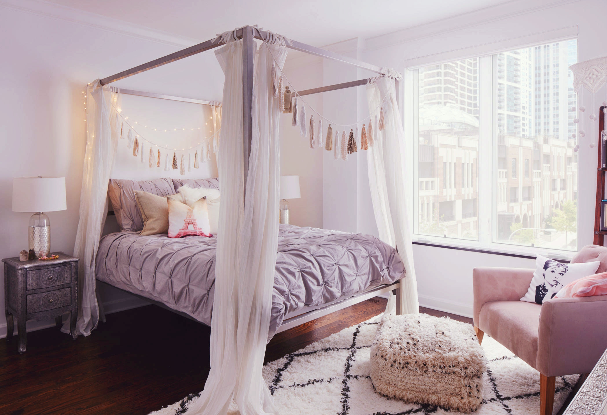
Forget The Trashy Purple Bedroom: “Lilac Gray” Is In Now
This season’s newest neutral? A smart mash up of lilac and gray which serves as an essential basic colour for every home in 2016. What’s great about Lilac Gray? It’s a unisex and much edgier gray that works for virtually any space. I can see this neutral in a master bath, hallway, bedroom or library.
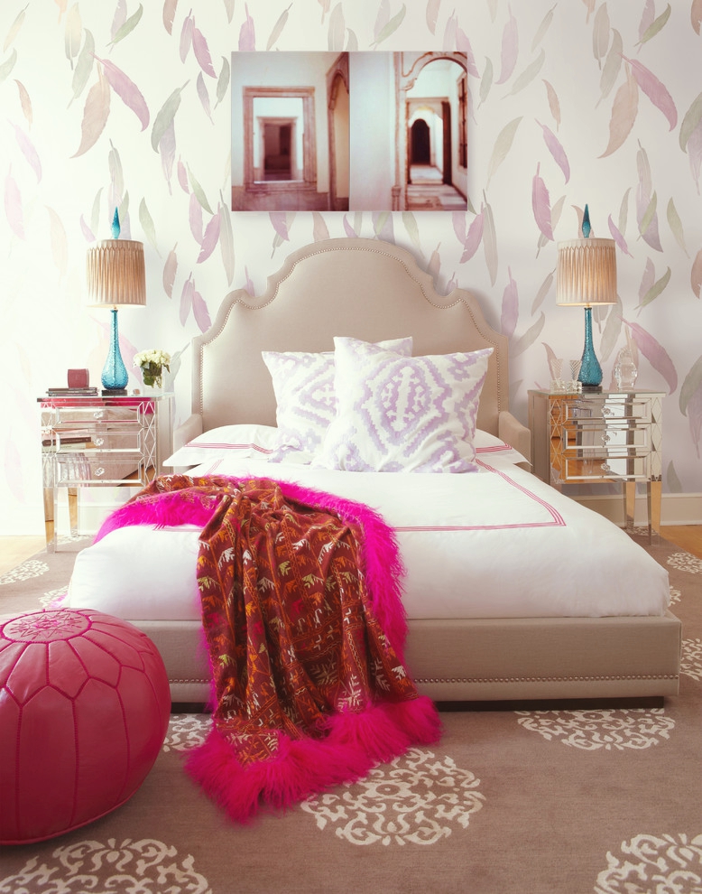
New York Style = “Iced Coffee”
“Iced Coffee” is a warm yet subtle brown that is soft and gender neutral. This pastel brown works with any season and is a timeless classic! The best part is that it works with more vivid colours. This feminine Manhattan bedroom mixes “Iced Coffee” with hot pink! I love how the feather-print wallpaper is paired with the feather accents on the blanket. It’s a great backdrop for turquoise table lamps. Too cute!


