[mks_pullquote align=”left” width=”300″ size=”24″ bg_color=”#000000″ txt_color=”#ffffff”]Ever wondered what the “secret sauce” is to making your home look like it was decorated by a professional interior designer?[/mks_pullquote]
We all want a beautiful home so we can wow our closest family and friends. For some of us though, our wallets are just not jumping for joy at the thought of splurging on a professional interior decorator. Who wouldn’t want their home to look magazine-worthy as if they just splurged on a designer? Trust us – getting the designer look in your own home is much easier than it looks!
A true designer knows it’s all about first impressions – and we’ve rounded up a few helpful tips that will help you whip your home into tip-top shape. You can make your home an impeccable show stopper by following these super EASY tricks professional designers swear by!
Trust us – it’s much easier to get the designer look at home than it looks! These industry secrets are super easy to follow and will take your decorating abilities to the next level!
Figure Out Your “Anchor” piece
DESIGN TIP: Don’t pick out any décor pieces or colors until you you’ve chosen your anchor piece. Once you’ve defined what it is, choosing colors and fabrics to match will be much easier.
Every professional designer will choose one element that will pull the entire room together. It can be a gorgeous painting, large sofa, or even pillows. The anchor piece is the most colorful piece in the room, and you can use it to choose the color palette for the rest of the room.
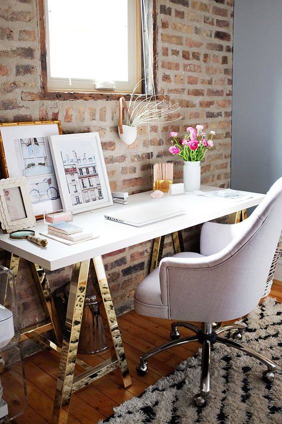
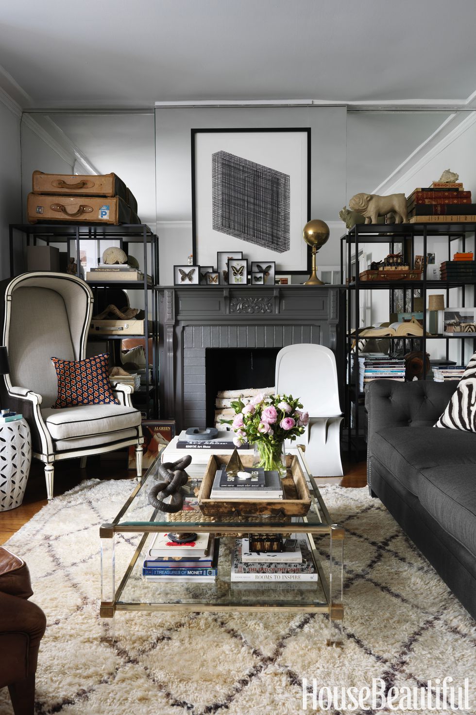
This glam home office features a stunning sofa that anchors the entire space. With so many combinations of decorative throw and pillow ideas for sofas, you can really style your space in a way that suits your taste.
Create Sharp Contrast
DESIGN TIP: Designers are usually brave enough to use a combination of contrasting dark and light colors. Why? Dark colors work wonderfully to highlight the lighter, more intricate details.
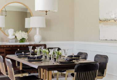
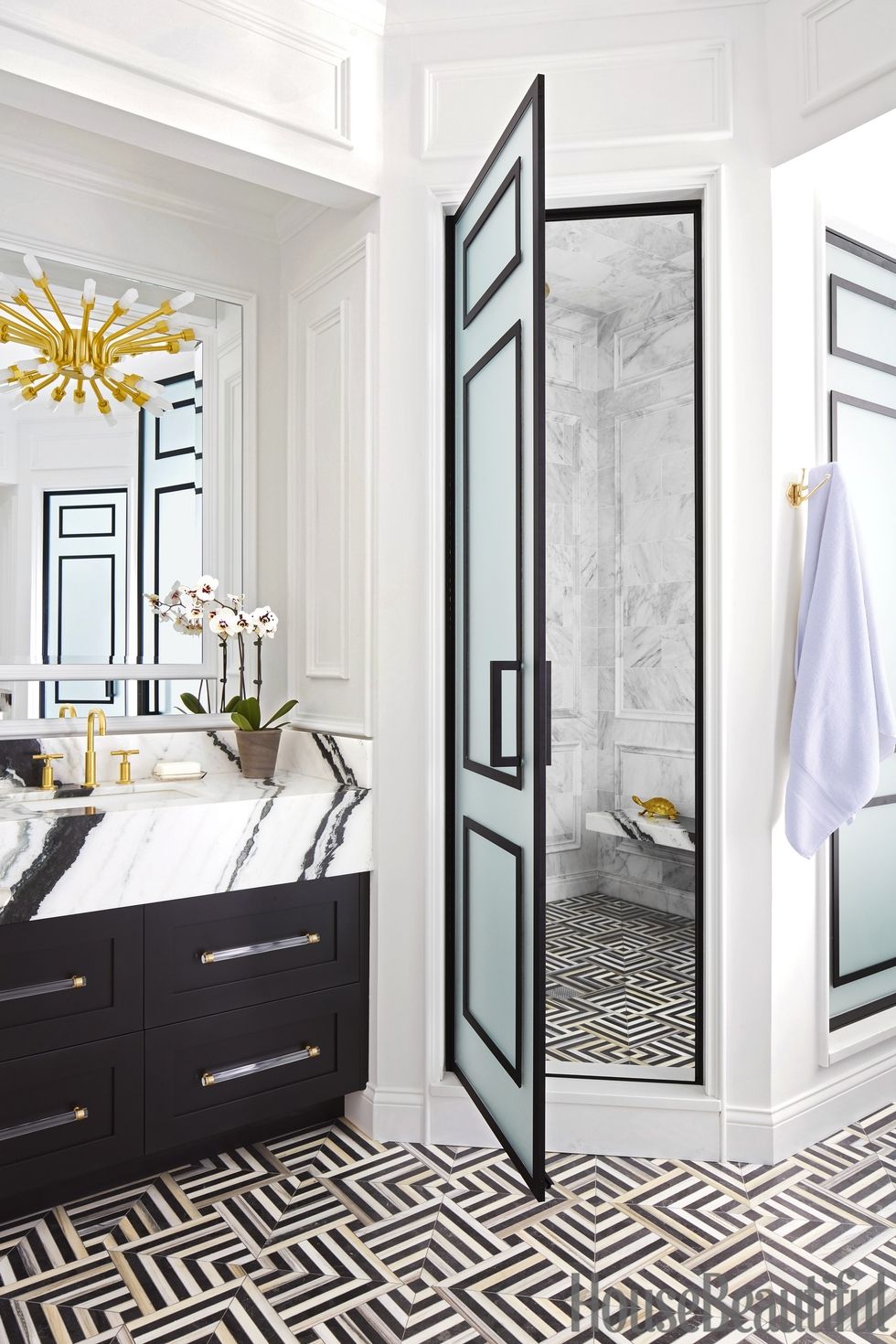
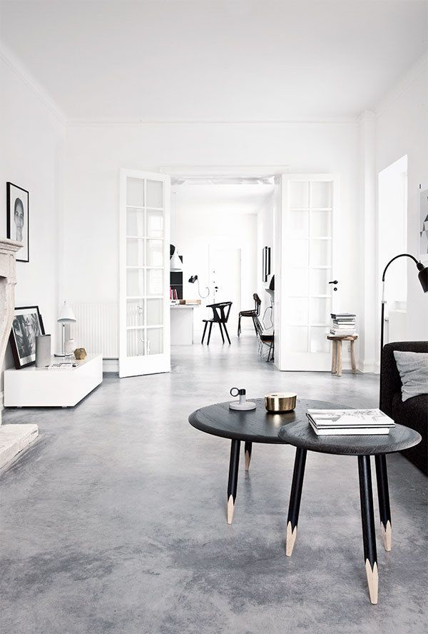
There are so many wonderful ways to create contrast. Firstly, you can create drama using opposite colors, such as black and white, brown and beige, or navy and white. Designers are usually brave enough to use a combination of contrasting dark and light colors. Why? Dark colors work wonderfully to highlight lighter, more intricate details. This makes the lighter elements a more dominant feature.
DESIGN TIP: The color saturation trick is my personal favorite!
Secondly, you can create contrast using color saturation. Color saturation is achieved by picking out one color you really love, and using it in darker and lighter shades. I personally think color saturation is great for beginner decorators. Since you’re sticking to the same color, it’s guaranteed to look good and you don’t have to worry about it matching with other colors.
Mix Textures and Trendy Home Design Styles
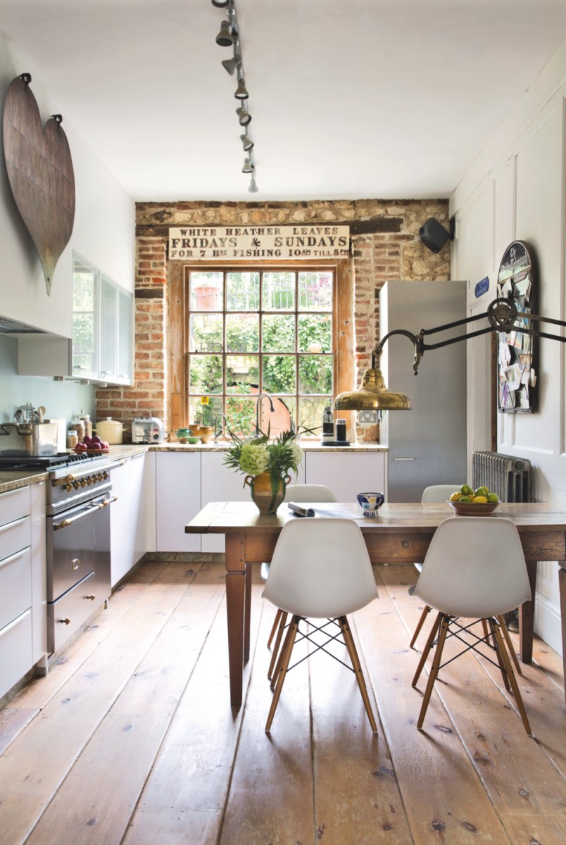
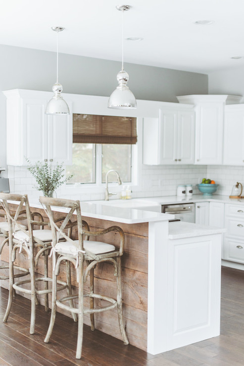
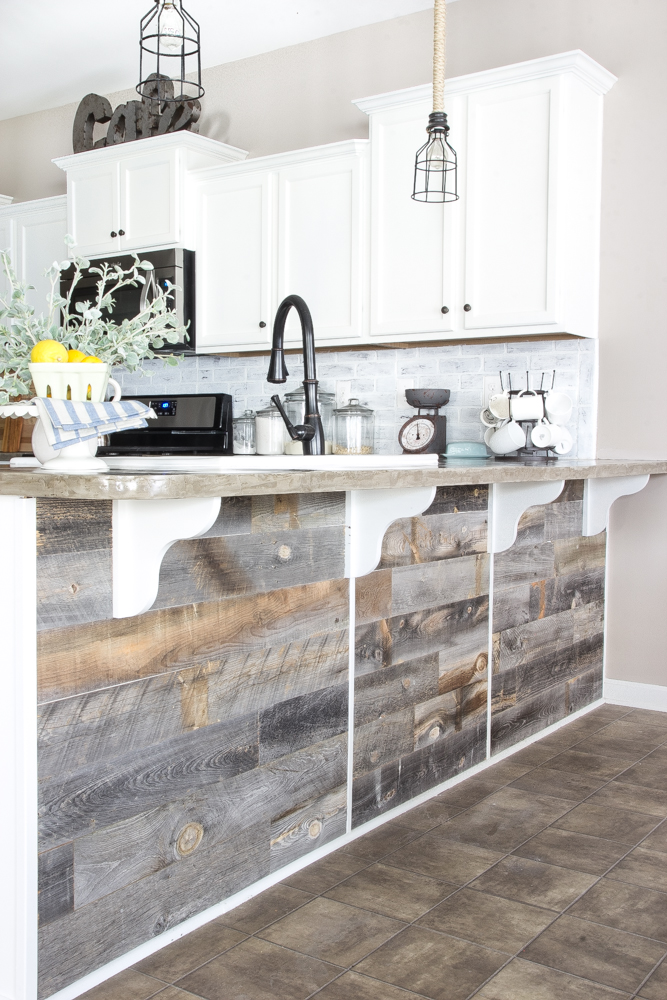
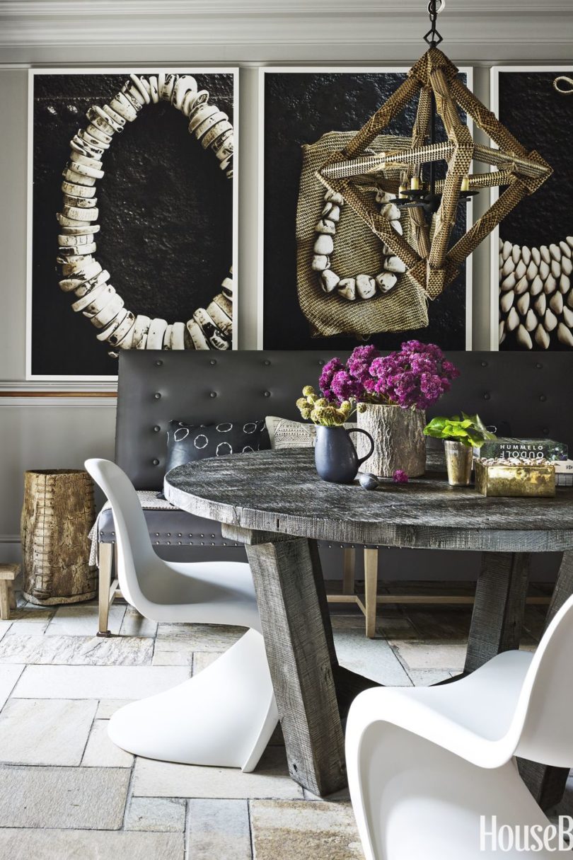
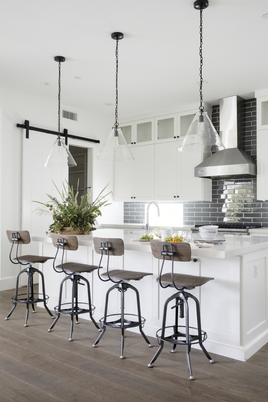
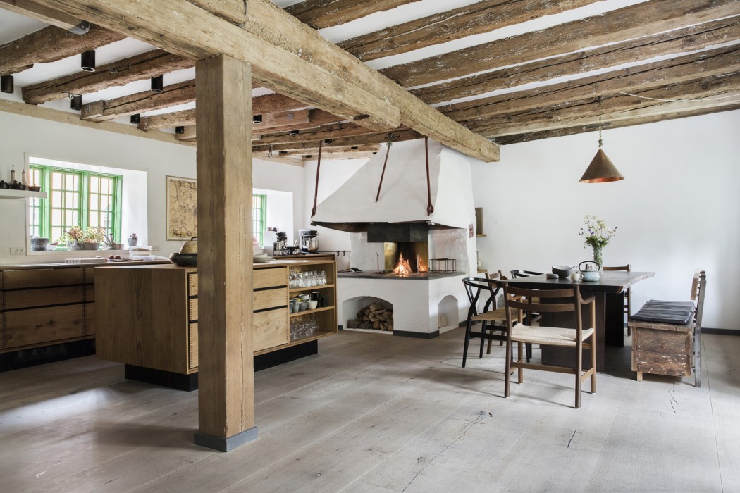
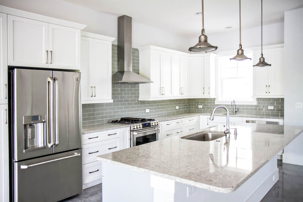
In this show stopping home, the rustic dining room décor combines classic elegance and touchable charm. The designer mixed the smooth textures of the white quartz countertops with weathered, rustic wood elements to create the perfect balance between new design and old world magic.
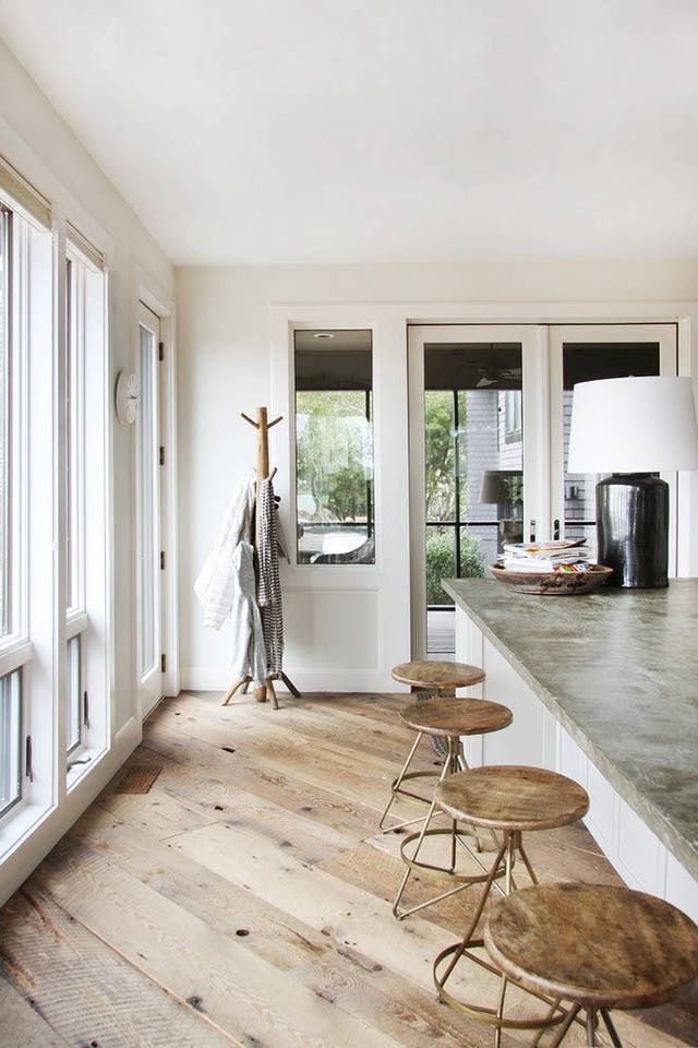
The secret to mixing styles is working with different textures. Looking to install smooth hardwood or tiles finishes? Then add an element of rough stone or a piece of weathered wood furniture. You can also add a touch of glitz and gam with crystal chandeliers, candles, and decorative rocks.
When mixing textures and styles, it’s all all about using creativity and imagination. Glass and metal finishes look stunning when combined with natural elements such as rustic wood beams, walnut floors, or handcrafted furniture that will warm up your home.
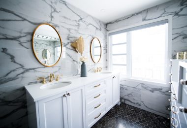
Style Your Bathroom Like a Hotel
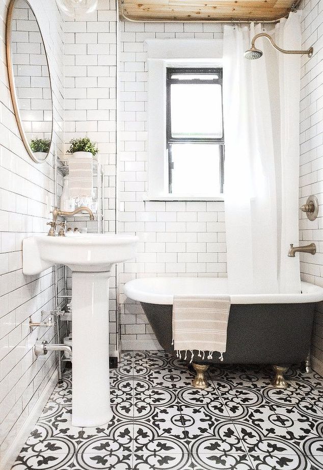
This step is super affordable and may actually may not even cost you a penny! When you take your towels out of the drier, roll them up tightly and stack them in metal baskets or on your countertop. Keep your towel game simple – plain white towels look clean and refreshing. Designers always use face towels and bath towels in different sizes for a true hotel experience.
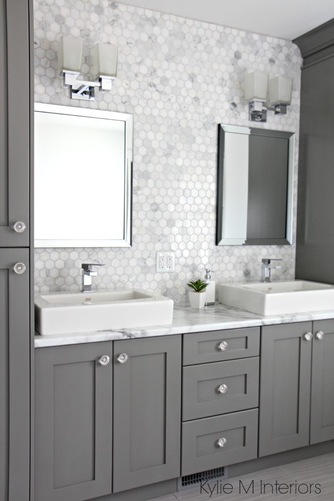
Don’t forget to completely clear off your countertops! Only keep soaps and shampoos on display that have super pretty and decorative packaging.
To mask an area in your bathroom you aren’t happy with, or simply to fill up empty space, set up a pretty floral arrangement in a glass cup. A bouquet will draw the eye away from a cracked countertop, old tile backsplash, or any other decorating mishap you have going on at the moment.
Don’t forget to completely clear off your countertops! This means no toothbrushes or makeup in sight. Store your toiletries in the vanity or if you’re working with a small bathroom, keep your toiletries stored in plastic containers that look neat and tidy.
Create Levels and Layers With Your Lighting
DESIGN TIP: Layering and placing your lighting correctly is the ultimate design trick of the professionals. So, how do you achieve this trick?
The biggest mistake made by rookie decorators is not layering and levelling enough lighting throughout their home. Layering and placing your lighting correctly is the ultimate design trick of the professionals. So, how do you achieve this trick?
Professional designers will use tall floor lamps, small table lamps, and extravagant chandeliers at different heights to create ambience. By combining different types of light at different levels, designers create the perfect mood and brightness professionally designed homes are famous for.
If you would like to highlight a painting fireplace, or ornate piece of furniture, use accent lighting which can be angled at the object to make it stand out from the crowd.
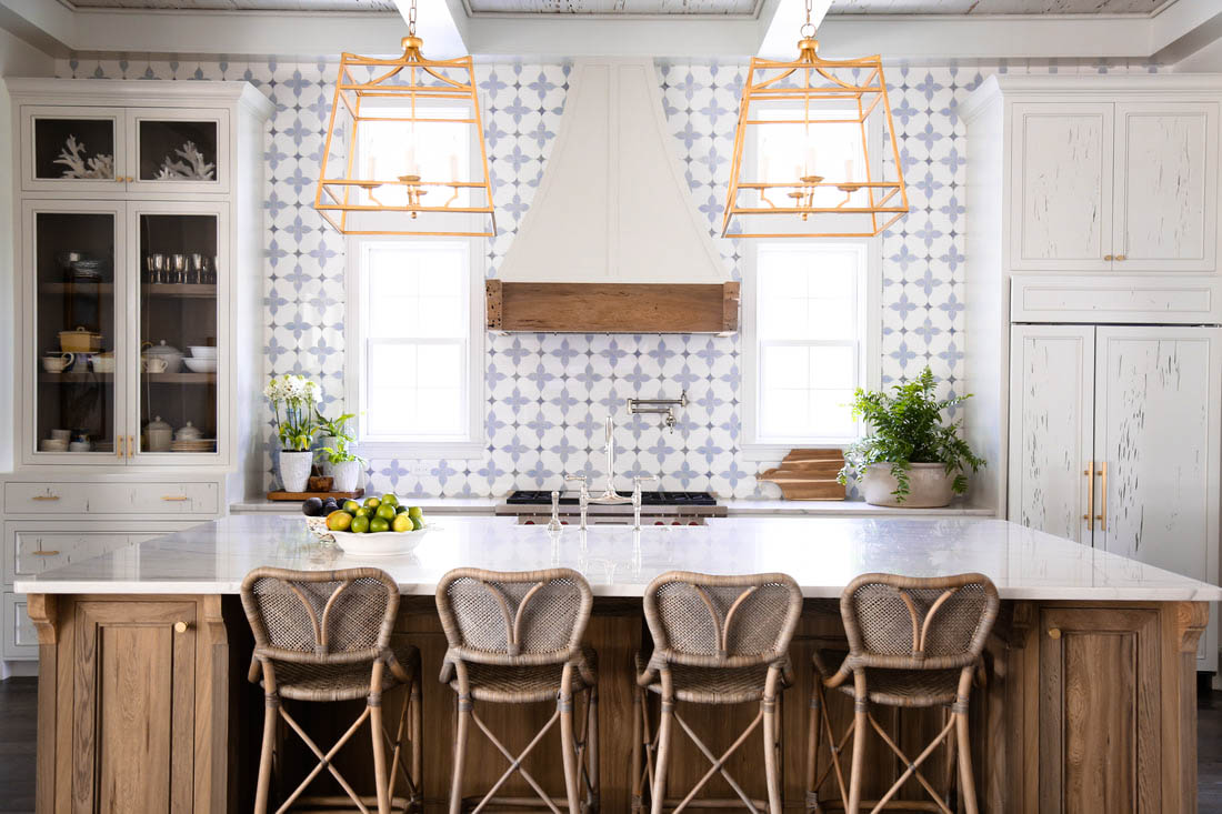
To create levels work from the bottom up. Add a tall floor lamp to a dark corner of your room, like next to a couch. Then, set a table lamp on a dresser or side table opposite of the room. Your main light source should be in the center of your room hanging from your ceiling, like a lantern or chandelier.